• WELCOME
  • SERVICES
  • SHOUT OUTS
  • CONTACT

Cedar Gandy

  • WELCOME
  • SERVICES
  • SHOUT OUTS
  • CONTACT

The Magnolia Market Fall Workshop 2015


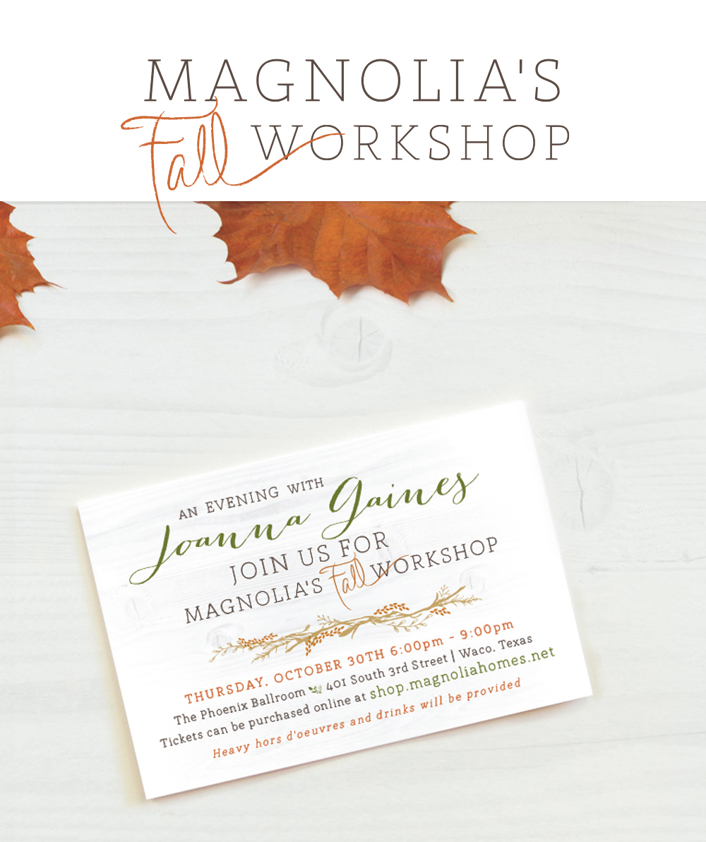
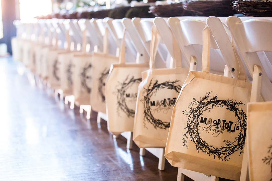
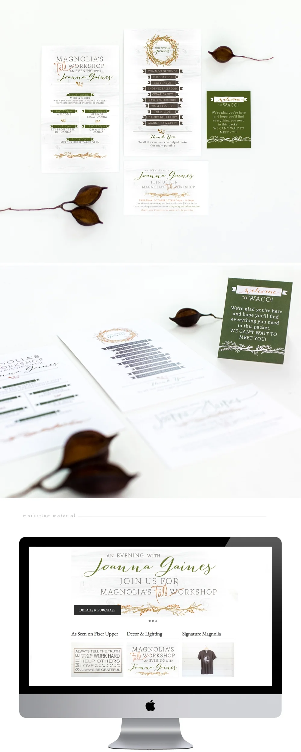
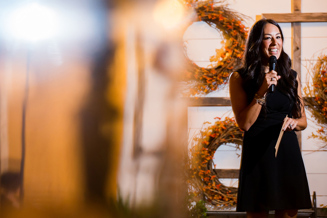
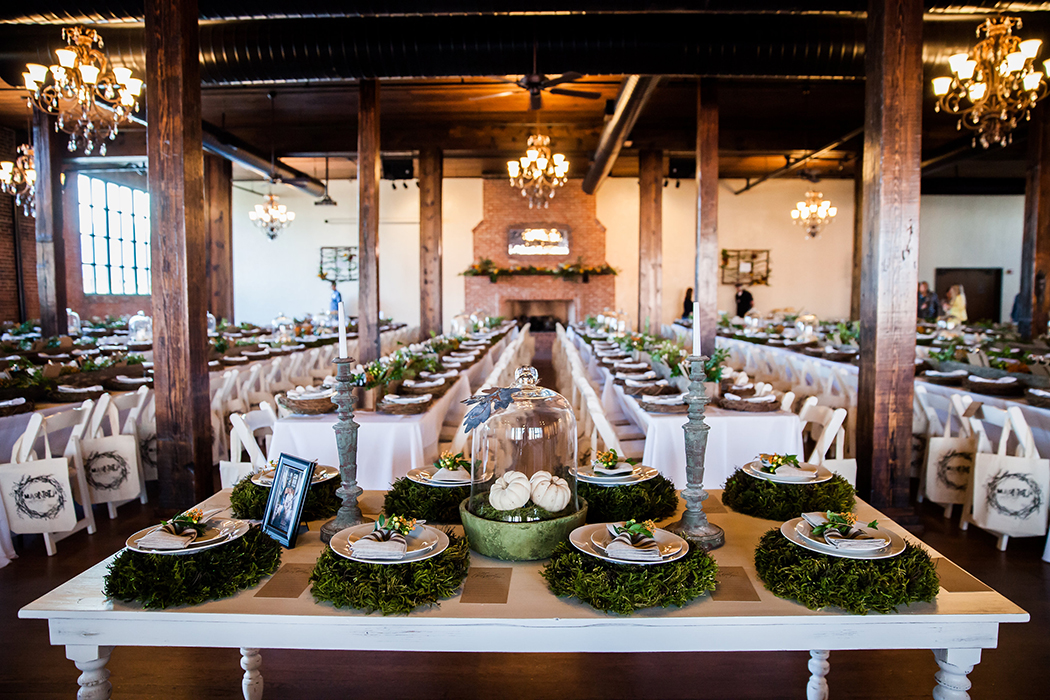
The Fall season welcomes cooler weather, leaves begin to change and the eager stirring of holidays soon to be celebrated bring a smile to most. My first fall project of the year was for Magnolia's Fall Workshop. Joanna Gaines of HGTV's Fixer Upper hosted a workshop where fans near and far could come enjoy a night with Joanna and her staff. I wanted to loosely illustrate Joanna's fresh, simple and yet "hand-touched" aesthetic that you see in her interior design throughout each piece of the marketing collateral for this event. Therefor I chose simple colors, added in some wood textures and created a few decorative graphics (wreath, leaf, and branch cluster)  to incorporate throughout. The first pieces were printed cards to have in the Magnolia Market and web graphics to  advertise and sell tickets online. Wether through the web graphics or the printed materials, each guest needed to be visually engaged enough to want to purchase a ticket and attend the event. Welcome packets were mailed out to each guest, welcoming them to Waco, sharing places to visit while here, and communicated the details of the event. Since these pieces were their first glimpse of the workshop, it was important that the right first impression was made. "All are welcome", "Come as you are", and " Warm relationships" is what I wanted to communicate to each guest as they looked through their packet. Once they arrived in Waco, familiar paper goods were waiting for them in their hotel room and sprinkled throughout the event. I enjoy designing work where I can be really specific to the client. Being brought in to design the pieces for Magnolia's Fall Workshop allowed me to do that. 

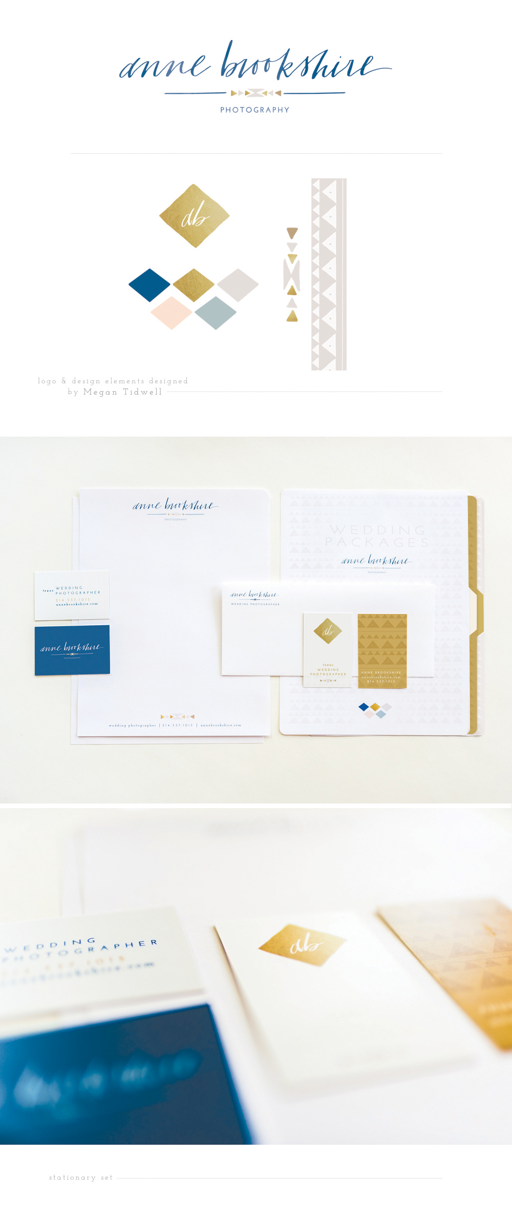
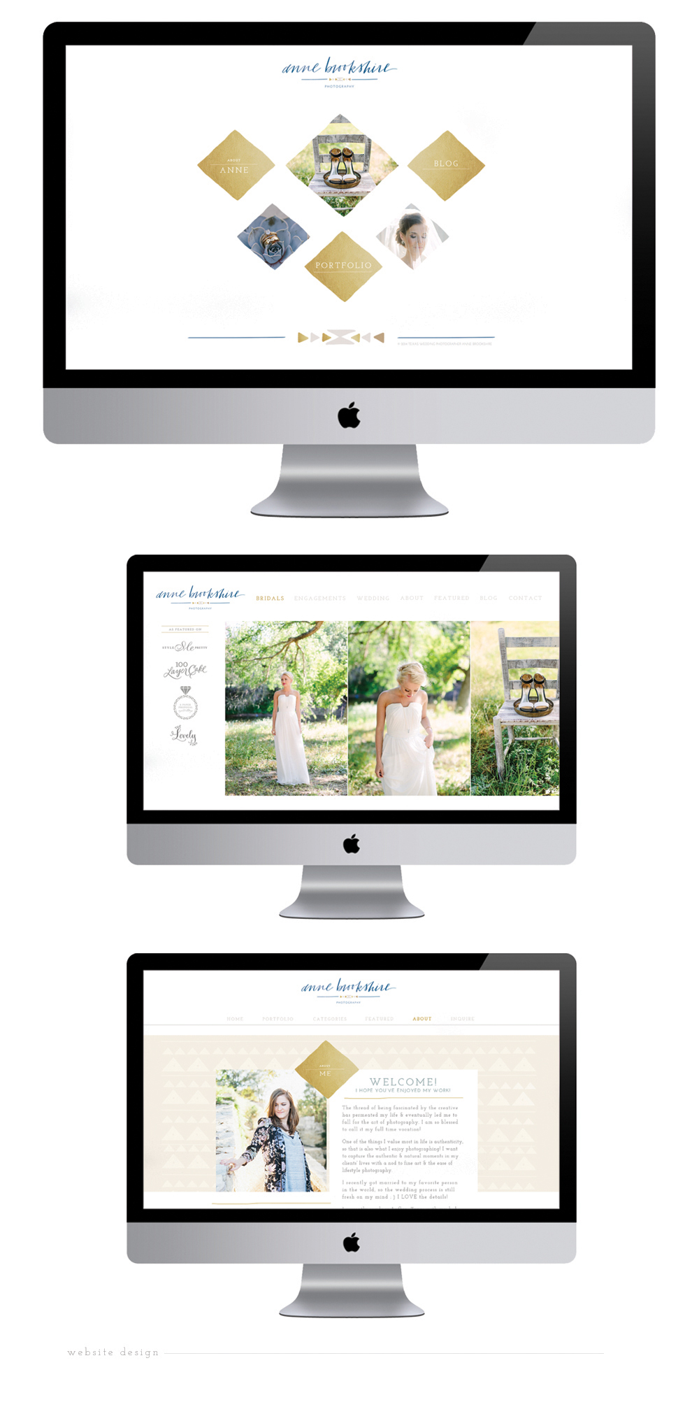
Speaking of catering to the specific look of a client, these custom notecards are a perfect example of that. A lot of my clients have a specific style, look, and "brand"...even my brides. Getting to create paper goods that represent them or their brand that they can also practically use is a win for everyone.    

Magnolia Market Cedar Gandy
tags: Graphic Design, Marketing Materials, Joanna Gaines, Magnolia Market
Monday 10.05.15
Posted by Haley Gandy
 

In it, to win it!


Of course, at the end of the day the goal of this project was to help Stephanie get elected and grab a seat on the Waco ISD school board. (Which she did. Yay!) I played the role of creating some great eye-catching and consistent marketing material for her campaign.

From the beginning it was important that whatever she put out for the public to see needed to be noticed, relatable, and memorable.  I wanted it to have a different look and feel from the typical red and blue political campaign, but not go too far out there. The first idea I came up with was to communicate her "resume" to the public using simple graphics and attractive colors so that her target audience would be visually interested and engaged. Everything I created needed to be attractive to both students in the school district, teenagers, parents and teachers. It was important that no matter who came across Stephanie's campaign material, they could relate to it in some way.

I thought it was important to have her picture and first name on everything from yard signs to direct mailers to her social media content. The reason being was in most political campaigns, the candidates are referred to by their last name, which is usually the most prominent focus, and doesn't naturally create a sense of "knowing the person". I decided to go a different direction with the vision being personal, approachable, memorable, and friendly. Therefore, we used Stephanie's first name and photo as the more prominent focus of this campaign, with the hope that it would draw people in and create more "personal, memorable" interaction. My motivation behind it was, when it came time for the public to vote (whether they knew Stephanie or not) they would be more inclined to vote for "Stephanie" –  the friendly, approachable, contributor to the community that they had become acquainted with through her campaign material.

StephLogo.jpg
StephMailer.jpg
StephWebGraphics.jpg
Steph2.jpg
tags: Graphic Design, Logo Design, Marketing Materials
Thursday 09.03.15
Posted by Haley Gandy
 

Art Center Fundraiser


Table Toppers is the Art Center of Waco's annual fundraiser, benefitting the art education and exhibits locally in our city. Businesses and organizations around Waco design elaborate table decorations that creatively represent their business or organization. The guests enjoy a champagne luncheon while taking in all of the wonderful creations and merchandise at each table. 

Not only was I able to participate in creating a table this year, but because Table Toppers was celebrating their 20th anniversary I was asked to design the visual brand graphics and marketing material for this year's event. 

I wanted to design a very simple and "classic" logo that could stand the test of time as this fundraiser continues into the future. In thinking about the 20th anniversary, I played with the idea of incorporating some lily flowers into the logo for special touch, but it began to take on a very feminine look. The logo represents the entire event and therefore it needed to appeal to both men and women, so the liles were scratched. 

Another symbol that represents the 20th anniversary is the emerald, which worked well as a bold design element that could appeal to both men and women. I ended up incorporating emerald elements throughout the details of the event branding.

I was very pleased to see how of each piece from the invitations, to the programs and all the signage came together in such a cohesive way to really elevate this special celebration year. 

TabelToppers1.jpg
TabelToppers2.jpg
TabelToppers3.jpg
tags: Logo Design, Marketing Materials, Campaign
Sunday 05.24.15
Posted by Haley Gandy
 

Local Business Rebrand


I enjoy the variety of clients I get to work with, and here and there masculinity will pop in and say, "hello", which is refreshing. Kingdom Automotive is one of those clients. I had done some work with Kingdom Automotive a couple years ago, and when they asked if I would help them with their new re-brand, I of course said, "YES!" 
   It was important that this logo fit the brand that Kingdom Automotive has been building these last couple of years. That meant I needed to quickly communicate professionalism, trustworthiness, integrity, attention to detail, and loyalty  to their customers through this new logo to come alongside their brand. 
   Going through my process of research, client questionnaires, and mood-boards, we were able to nail down some visual elements that we felt could be the main anchor of the logo.  Kingdom Automotive has a desire to communicate honestly, provide trustworthy service, and always operate with the customer's best interest in mind.  We both felt that the shield I created communicated those core business values that the company wants to portray.
  

KingdomLogo.jpg
KingdomLogoSketches.jpg
Kingdom2.jpg
KingdomBranding.jpg
KingdomCards.jpg
KingdomPaper.jpg
tags: Logo Design, Marketing Materials, Stationery
Saturday 01.24.15
Posted by Haley Gandy
 

AMITY RISE


Amity Rise is another perfect example of why I have the best job. Hearing the dreams, plans, and vision of a business before it goes "public" is being invited into one of the best secrets. Listening to the story of where a client has started, who they are, where they see their business going, and what they dream of it growing into is inspiring. 

As colorful, personal, and maybe even whimsical as this project turned out to be in the end, there are quite a few practial steps that my clients and I go through to get there.

Yes, there is a detailed client questionnaire; yes, there are meetings, as well as emails, phone convos and revisions. However, there are also many deeper questions that need to be asked by me and answered by my client to allow for those personal touches to show up in the end.

One of our conversations was on how Sarah is very creative and free flowing. I discovered that she loves live greenery and color and tries to incorporate that into her interior design business when possible. Whereas her husband is a little more on the structured, methodical, and logical side of things--yet this is THEIR business together. How do I represent both sides of this partnership and the roles they play in their business visually?

Through the typography, the combination of the colors, as well as the structured geometric shape combined with the free-flowing illustrations, I was able to bring that balance into the logo.

People often think that a logo is the first thing you need to start a business. Although it's important and needed, creating a logo for a business or company comes after the content (mission, values, goals) are already in place. Sarah and Wes came to me with their "content", or sometimes referred to as their "brand" which is the fundamental characteristics which make their business distinct, authentic and relevant to their customers. From that place we were able to get on the same page in creating the visual statement of that brand which is AMITY RISE.


tags: Logo Design, Illustration, Marketing Materials, Amity Rise
Saturday 01.24.15
Posted by Haley Gandy
 

Insurors Indemnity


Insurors Indemnity Companies has recently rebranded. While they are still the same company, they now have a new look which I was able to help introduce. Although I didn't create their new logo, I did get to put together the design of their business cards, letterhead, and corporate envelopes. I started with the design of their business cards and came up with 5 initial layouts. As we narrowed it down from there and chose the best composition, the other pieces began to take shape. We wanted the business cards to make the best first impression when being handed out by their agents, so I offered a 16pt. silk laminate card as an option, which turned out great. Right out of the gate, trade show banners were also needed as a part of their new brand launch. Like a billboard, these needed to be bold and simply laid out in order to read from a distance and quickly comprehend. I look forward to working with Insurors Indemnity on more marketing pieces in the near future. 

Insurors Indemnity - Cedar Gandy
RoadRunnerFinanceBrochure1.jpg
RoadRunnerFinanceBrochure3.jpg
RoadRunnerFinanceBrochure4.jpg
Insurors Indemnity - Cedar Gandy
tags: Marketing Materials
Thursday 01.15.15
Posted by Haley Gandy
 

I Love Working with Other Creatives!


Don't you just love the logo and design elements that Megan Tidwell created for Anne?! I do. It was so fun to take what she created and carry it throughout the rest of Anne's visual branding, marketing materials, and website. 
 
A couple summers ago I had the pleasure of sharing a room for two weeks with Anne in Amman, Jordan — ha, what fun and memorable times! It was shortly after that trip when her photography business really took off. It has been so fun to watch her grow her business, become successful, and teach herself most of what she knows. It was a honor to be brought into her process of re-branding and come along side her in streamlining the look of Anne Brookshire Photography.

Anne1.jpg
AnneWeb.jpg
tags: Stationery, Website Design, Marketing Materials, Anne Brookshire Photography
Wednesday 09.24.14
Posted by Haley Gandy
 

Who's paying your bills?


SimpleBills is a Waco based company servicing many university markets across the nation. They are the roommate utility billing service specializing in the student housing market. SimpleBills brought me on board to give their marketing materials a fresh update and to create a few new pieces. The same brand message still needed to be communicated but in a new way visually, so I gladly stepped up to the plate. I was able to modify some of their main graphics for a cleaner aesthetic and add some new colors, textures, and photography. SimpleBills does a great job of getting the important information and facts out there in a very direct way, and I wanted that simple yet direct communication to transfer through the design as well. Each piece needed to fit into the "design family" I was creating yet separately appeal and target corporate properties as well as engage students and parents. My goal was to design new marketing material that is easy to comprehend and engaging to look at, while also captures the attention of the target market. I really enjoyed getting to create a 22 page booklet that shares the story both visually and conceptually of how SimpleBills got started and how to take advantage of their services.

I love getting to be apart of each clients business and story, a relationship that keeps going project and project.

SimpleBills Graphic Design
tags: SimpleBills, Waco, Graphic Design, Publication Layout, Marketing Materials
Friday 06.13.14
Posted by Haley Gandy
 
Newer / Older

Copyright © 2014-2023 Cedar Gandy   |   All Rights Reserved