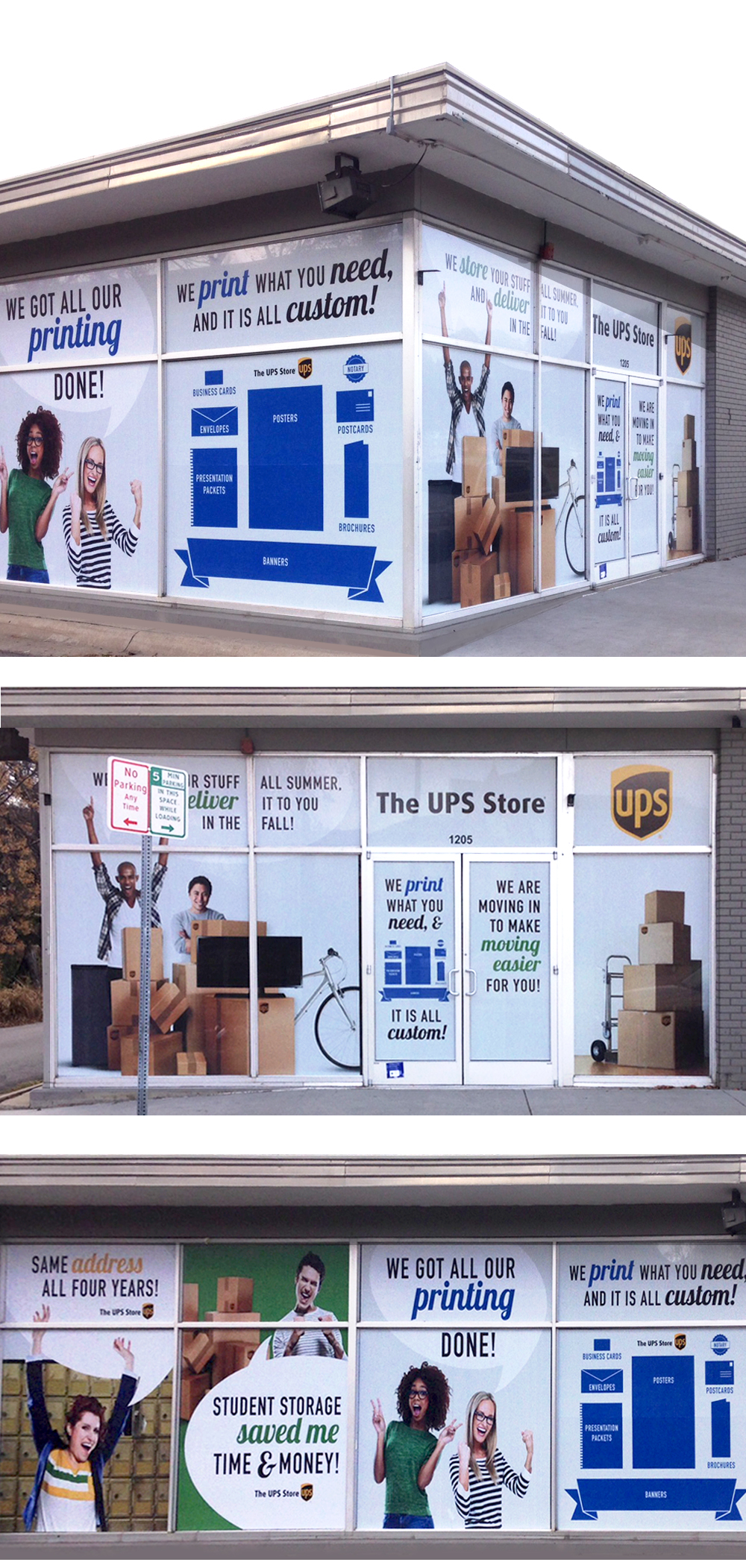
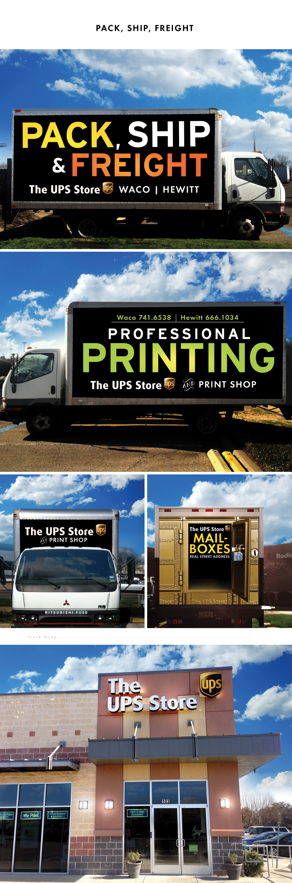
This was an interesting project because I was working with one of the most recognizable brands in the world. Everyone knows that UPS does shipping, but when the time came to re-wrap their box truck, and create window wraps for their new store, the owners of the UPS Store (one happens to be my husband so how could I say no to this one!) came to me and asked "How do we convey that we do printing, mailboxes, and more?"
We worked through several different options. Lots of sketches, brainstorms, discussions, etc. Then we realized an old design secret might hold true in this case---sometimes less is more.
A pet peeve of mine are billboards and signs designed in such a way that you cannot actually read them when you are driving down the road. So for this project, we went for something simple, big, bold, and easy to read. What we came up with communicates the message loud and clear, and you can see it when you're driving by at 60 mph.
Check it out for yourself--next time you need printing done head by one of the Waco UPS Stores!
Paint : Anointed to Serve
As a group of artists gather near the Mediterranean to pray, worship and create art, beautiful things are happening. Here is a glimpse at that raw beauty. "Jesus' hands dripping with oil, ready to anoint us, (his children) to serve others as He serves us".
Featured : Ruffled Blog
Yay! Cedar Gandy is being featured among many other wonderful talents on Ruffled Blog. What a treat! I hope this is just the beginning!
Personal Spin for a Personal Brand
When a client has ideas in their head of what they want, and they come to me to help formulate those into something tangible, the excitement begins. For me, this project started out with a lot of question asking and listening to get a hold of the dreams, thoughts, and ideas that were inside Jenn's mind. As always, it is important for me to have a really good understanding of my client's wants, needs, and desires before I begin my creative process.
Jenn is a spiritual director and small business mentor for women. Her logo and visual branding needed to be professional but approachable, clean and tailored, as well as fresh and joyful. One of the fun design challenges was that she wanted to incorporate a fingerprint-like pattern into her branding somehow.
During my beginning processes of brainstorming and sketching, I was in Fort Worth one weekend and saw a glimpse of a contour map. I love maps in general, but the lines of this map stood out to me as I related what Jenn does with spiritual direction and small business coaching to the directional lines on the map. Like a fingerprint pattern which represents one's uniqueness, I could not help but think about how the path that each one of us take in life is also unique and rarely ever looks like someone else's. I thought creating this directional contour pattern would be a fresh and personal spin on the fingerprint pattern. Once I got my ideas out on paper, Jenn was super excited about the design–I was able to grasp the concept she was going for and make that concept come to life with a distinct and one-of-a-kind perspective.
Watercolor Custom Wedding Suite
A little break from the computer...a custom watercolor wedding invitation suite...aw enjoyment!
New Branding : Amity Rise
Celebrating with my clients Wes & Sarah Lipscomb of AMITY RISE this week as they roll out a sneak peek of their new business and inventory! Be sure to keep some "blow money" in your personal budget, and stay tuned for their full product launch so you can spend, spend, spend!
Photo shoot with Jared Tseng
My website is coming together, and the professional photos of my work thanks to Jared Tseng, will be the finishing touches!
New Years Eve 2013 : Cedar Gandy is Born!
Bringing in the new year with the dearest of friends and the beginning of Cedar Gandy!