There’s no place like home, and my client Pam Tucker knows that for a fact. Pam is a local real estate agent specializing inluxury homes. For years Pam has been helping her clients find their dream home with customer service that goes above and beyond. One of the things I respect about Pam is that she is innovative in the way she does business and markets herself, so I knew working with her was going to be a great project.
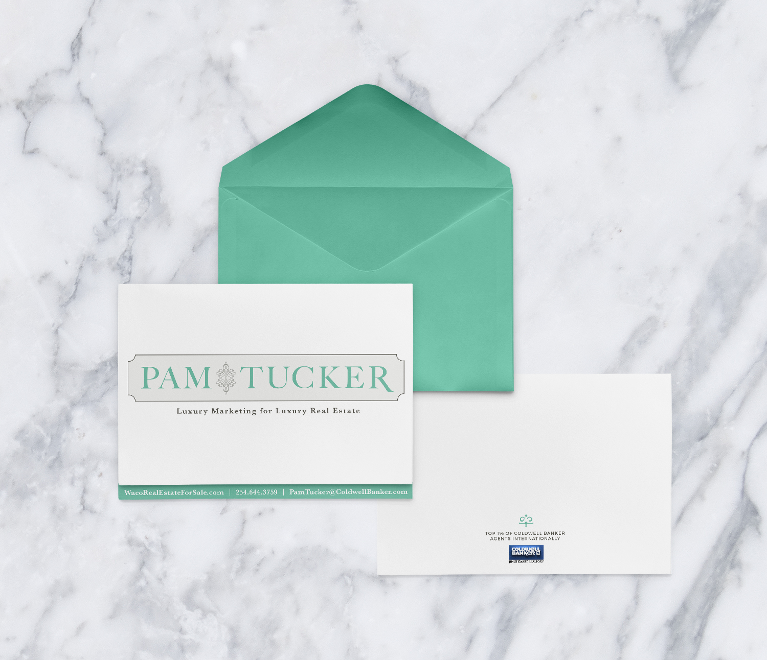
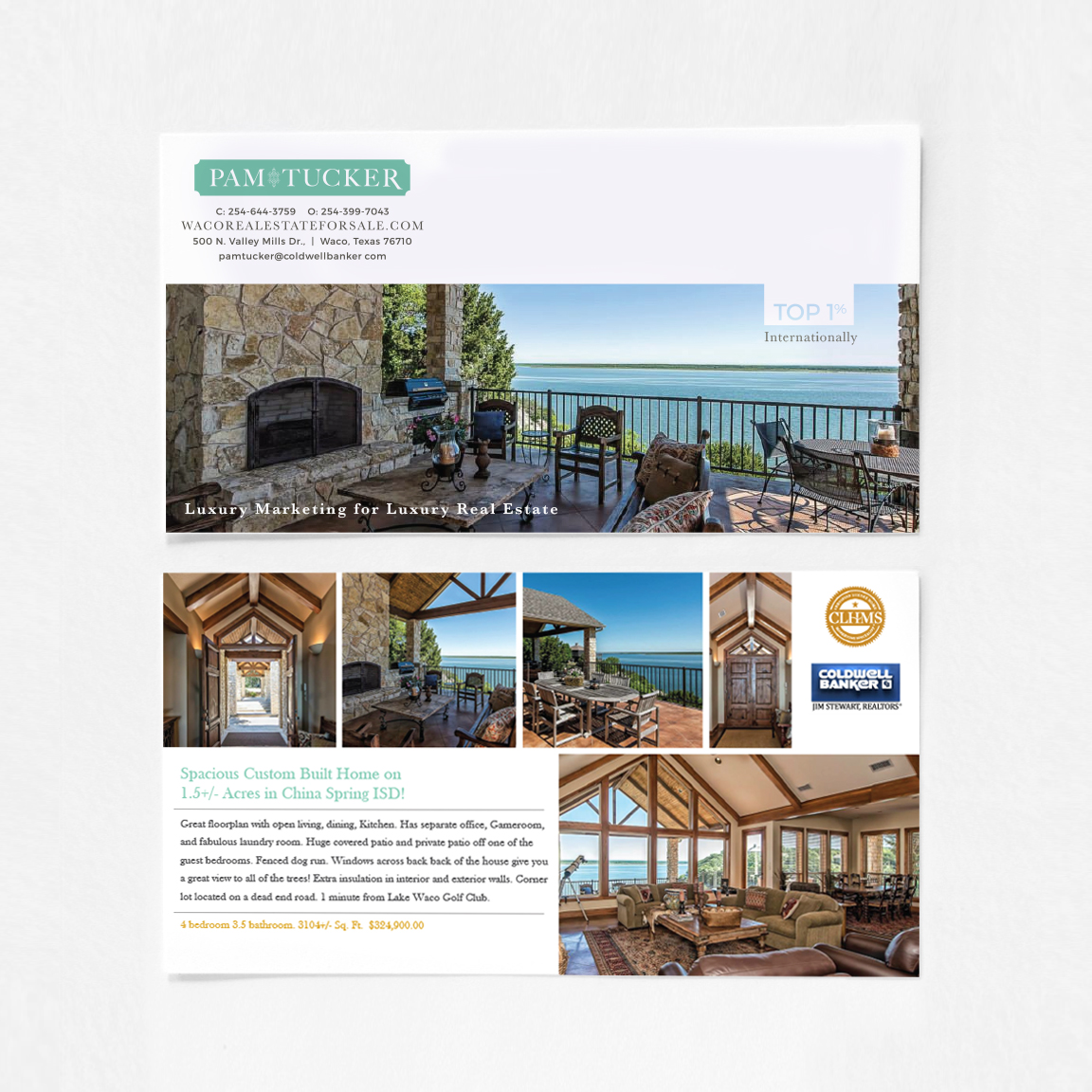
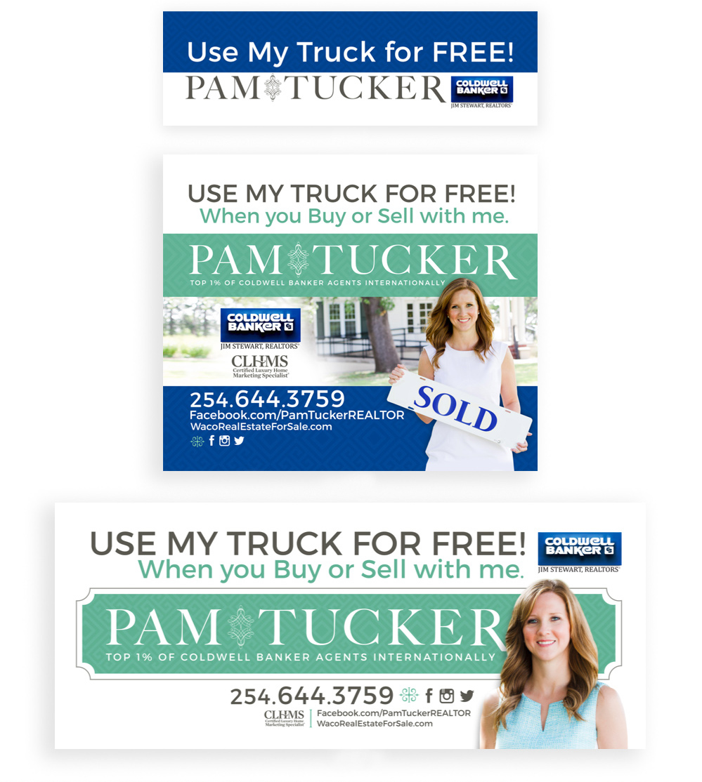
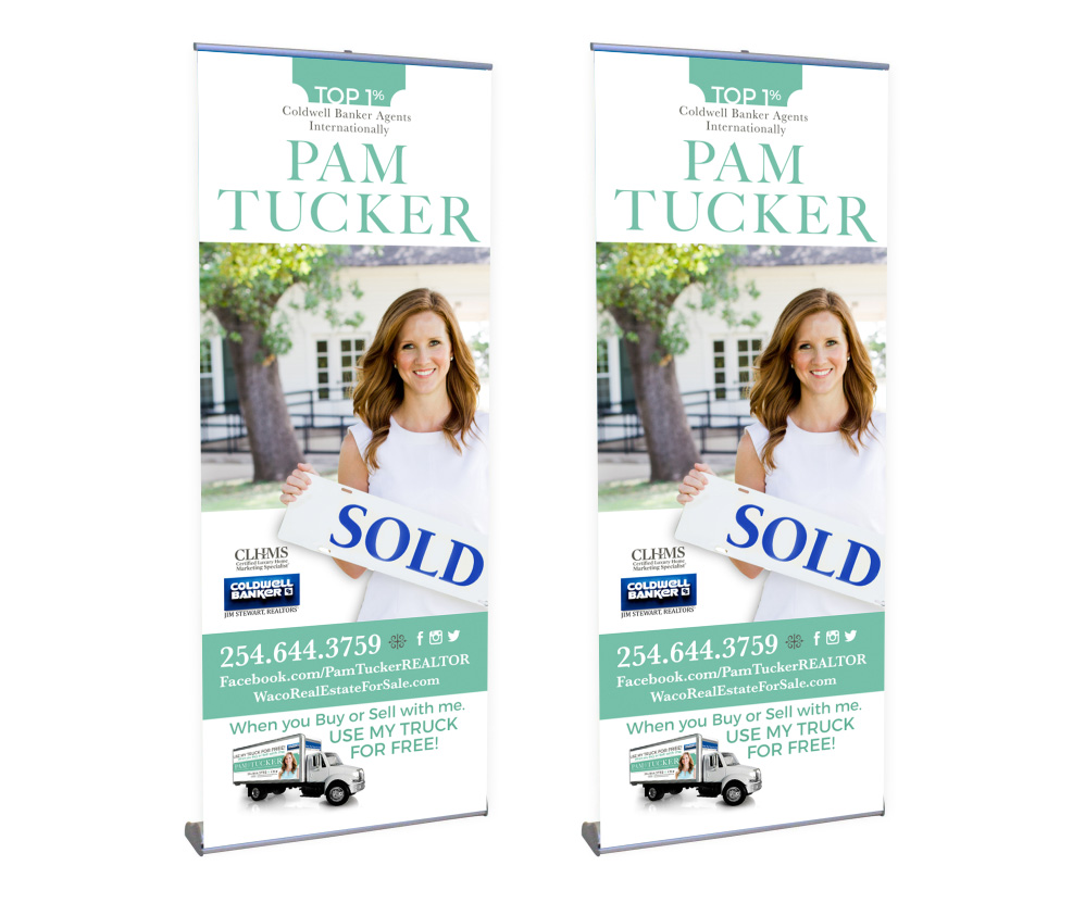
Pam’s old marketing materials didn’t represent the quality and service that she offers her clients. She was also adding a moving truck to her real estate service. This truck would be free for her clients to use as they got ready to sell and pack up their home - how genius right?!?! This natural transition in her business was the perfect time to transition her visual branding as well. It was time to get rid of the primary red and blue she had been using and introduce a fresh and updated look. We began to work together to create solid visually brand that could grow with her business.
This process was a couple months long from our first meeting until the completed wrapped truck pulled into her driveway. Since Pam works with Coldwell Banker, (a brand and logo that need to be on everything she put out there) picking the right color palette to complement that current look was extremely important. We still wanted her brand to stand alone and be unique while being able to pair great with the visual branding of Coldwell. As I was meeting with Pam at her office, I started to look around and notice a repeat of some of the same colors over and over again. Her picture frames, pillows, art and even the clothes she was wearing all had touches of gold turquoise, corals, and neutrals in them. Since we are literally branding Pam Tucker, I thought that the colors surrounding her would be a good place to start. I came up with about four different color palette options to present to Pam. Each of them had a shade of turquoise/aqua and a shade of gold which complemented the Coldwell blue.
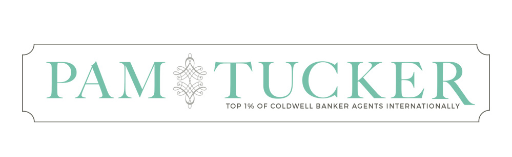
The other key component of Pam’s rebrand was to visually communicate Pam’s specialty in the luxury housing market. Kendra Scott and Tory Burch immediately came to mind as successful business women who were in the luxury market also. Both of these women's brands are very recognizable and are well known for quality and esthetic. I began to get inspired and brainstorm how I could create something similar for Pam.
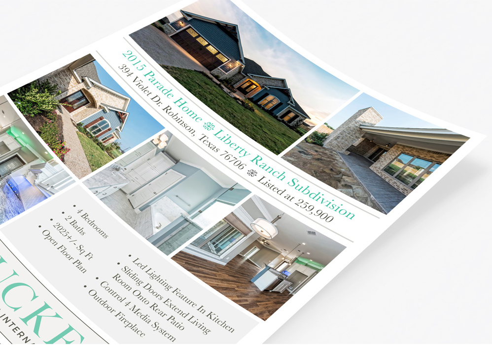
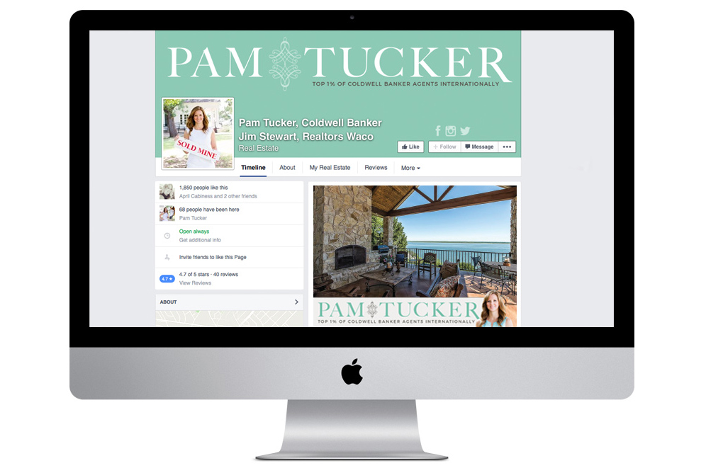
I sketched out a couple different "fancy" looking marks that could be paired with her name to communicate that luxury feel she was going for. However, Pam wanted to see an actual house or key of some kind to represent luxury homes with he rname. Listening to my client’s desires and combining them with my knowledge of marketing and graphic design is always important to me. In the end we decided to stick with a couple clean flourish/marks, that were not so literal and that satisfied both of us. With a finished logos, I was able to restructure new layouts of her marketing pieces (direct mailers, flyers, stationery, etc. ) to match this clean, simple, and sophisticated identity.
The moving truck had to be considered a huge billboard that was easy to read and clearly communicated Pam’s services. As a graphic designer I loved getting to work on such a fun canvas. Pam and I are both proud of how her new visual branding and marketing materials came together in the end. I look forward to seeing Pam continue to expand her business and continue to grow her brand in Central Texas!