• WELCOME
  • SERVICES
  • SHOUT OUTS
  • CONTACT

Cedar Gandy

  • WELCOME
  • SERVICES
  • SHOUT OUTS
  • CONTACT

Cedar Gandy and THI


Often when people think about branding, they think about businesses, but it is just as important for nonprofits to have good branding and strong marketing collateral. I recently got to work with Baylor University’s Texas Hunger Initiative (THI) to develop a marketing piece for them. The organization is doing great, high-impact work and I really enjoy working with them. After this latest project, I sat down with the organization’s communications director, Kasey Ashenfelter, to talk about what they do and hear a little more about why he chose to have their brochure professionally designed.

Before we talk about our work together, can you describe what it is that THI does?

The Texas Hunger Initiative, based at Baylor University, is a statewide, anti-hunger program. I always tell people, we don’t give food to people, we work with the agencies and organizations that give food to people. There are so many great people and organizations doing really great and important work, but it’s hard for all of that work to be coordinated—those organizations are already working incredibly hard as it is, they don’t have time to do it! So, that’s where THI comes in. We bring people together—state and federal agencies, schools, congregations, businesses, etc.—to help them collaborate and coordinate their work and make it even more effective. Our goal is to find a solution to hunger in Texas and in the United States.

Ending hunger in the United States, nothing major! So, as you’re working toward this goal, what made you want to work with Cedar Gandy?

Well, as you can tell, sometimes clearly describing what we do can be difficult but doing so is important. We needed new marketing material, a brochure or handout that we could leave with people. Like a lot of nonprofits, we don’t have a graphic designer on staff. Most of the time, we just get by with my self-taught design skills! But, after a first draft, I just didn’t feel like we were hitting the mark since this was going to be our centerpiece marketing material. This would be the piece that got handed out most—to prospective donors, nonprofit partners, elected officials—and we knew it needed to be good, so, as is always the case, my first call was to you.

It’s always a great call to get! You said, “as always,” and I know this isn’t the first project I’ve done with THI, but could you tell our readers a little about the work we’ve done together?

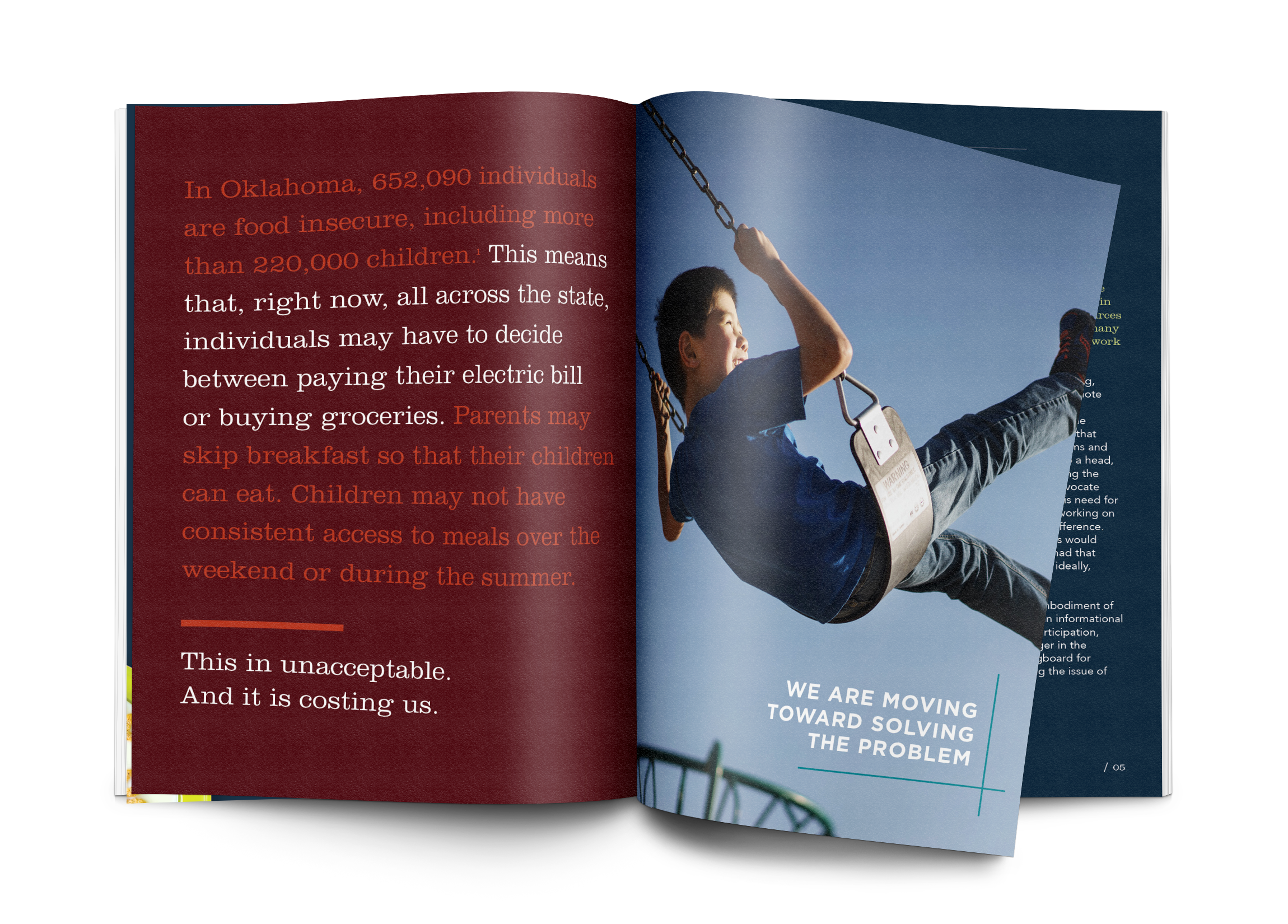
This isn’t the first time we’ve hit the limits of our skills! We recently partnered with organizations in Oklahoma as they started a statewide anti-hunger effort similar to THI. We’ve worked together on a couple of reports and knew right away that they needed to be very high-quality. More than just reports, these were going to help launch an effort and would be equal parts informative and marketing material. This was another case where we knew that the return on our investment—working with Cedar Gandy—would absolutely be worth it.

I'm so glad to hear it! Okay, now that we’ve gotten that bit of work history out of the way, let’s go back to the latest brochure. Why did you feel it “wasn’t hitting the mark”?

Well, it’s hard to say exactly—I guess if I knew exactly, I may have been able to fix it myself! It really was just a feeling that our first draft wasn’t engaging. It didn’t look bad, but it didn’t seem to tell our story, visually, the way I wanted it to. I also couldn’t figure out spacing. It felt like I’d have too many words on one page or not the right amount of graphics on another, and we’d move things around but couldn’t quite get it. We just knew, overall, it wasn’t the piece we needed to showcase our work.

Right, I remember the first time we talked about the brochure, you didn’t quite know what you wanted but you knew you didn’t have it yet…

I remember that first time we talked about it too. The great thing was, I was able to be so vague about it and you immediately had specific adjustments that you thought we should make. You started listing your initial ideas and I just thought, “Yes, yes! That’s it! That’s what I’ve been trying to say!”

I think one of the first things we did was change the main color on the brochure…

Right. We had used a golden/brown color, because we’ve liked to have an earthy, grassroots feel to our design elements. You changed that to sky blue—literally in some places the background is an image of a blue sky! And in some places the background is just white. That change completely invigorated the piece; it immediately felt more energetic and engaging.
 
Another change you almost immediately suggested was adding a more human element to the design. You explained to me how human faces really engage people, particularly with work like ours that is trying to help people. So, you switched our cover image from vegetables to a smiling kid eating fruit—and, of course, you were so right! You look at the cover and into the kid’s eyes and can’t help but be engaged. And, as a side note, I really love that you used a picture of a smiling child who was eating instead of a picture of a sad, hungry looking child. The images you used are positive, inspiring, and show what “success” looks like for us. I really like that.

Once we made those big changes, the brochure came together pretty quickly. I was able to just keep vaguely describing what I wanted, and you seemed to actually understand and turn that vision into a reality.

THI_beforeAfter.png

That’s my job! Ha! But I do really enjoy helping clients turn a vision for their brand or company and into reality and bringing it to life. This was a fun project to work on! Are there any other aspects of this project we haven’t covered that you’d like to share?

Well…I think we’d be remiss not to talk about the one snag we had…the typo…(plus I want to make sure your readers get to know how you handled it!)

Ugh…if we must…

Let’s just say, the back of our brochure has a common phrase on it—a bible verse that a lot of people are familiar with. So, when it went through our rounds of edits, our team would read that verse and their brains would simply fill in the missing word. No one noticed! And I had so many people read it—I even showed it to my mom and sister-in-law to get an outside perspective. We all missed it! But the real reason I wanted to tell this story is for the resolution—and you might not say this yourself! I think I told you about it via email. Before I could even think about next steps, you had fixed the mistake AND were delivering us reprints! I love the brochure, but that level of customer service may have been the most impressive part of the process!

Oh gosh, I can’t believe we all missed that! But I’m glad we got it fixed. And now that I got that unsolicited plug…any parting wisdom you’d like to offer or any plug you’d like to make for THI?

I’ll never turn down an opportunity to make a plug for THI! All I’ll say is that hunger is a very real problem in our state and our country and it doesn’t have to be. I know there are efforts in your community to find solutions to hunger—join them! And reach out to me (Kasey) if you want to know how! We’ve got a great brochure that will tell you what you need to know. :)

Clearly conveying your message is so important to your business or nonprofit. Doing it well is always worth it, hints why we recommend working with you, Cedar Gandy!

Friday 09.07.18
Posted by Haley Gandy
 

Keep it simple


Let’s play a game. I’ll tell you the name of a business I worked with and you try to guess what it does. Okay, here’s the name: Drink.

Any guesses?

If you guessed the business offers refreshing drinks to hot and thirsty customers at the Magnolia Silos, then you’re right! Simple, right? The business is called Drink, and it sells drinks. That seems easy enough for a graphic designer. All I have to do is come up with a simple design that stands out and gets noticed; no problem!

...well maybe not so fast.

One thing I’ve learned over the years is that most often, designing something "simple" is anything but.

The concept for Drink is smart. My client owns several food-related businesses, including one that sells food at the Magnolia Silos. After feeding Fixer Upper fans for a few months, she noticed that there wasn’t a great spot for customers to just get something to drink. So, she decided to open up a beverage stand. Now, Drink offers sodas, tea, and sparkling water to thirsty Magnolia Market shoppers and locals alike.

When we started talking about the logo design, we knew we needed the final design to stand out and be easy to read. We imagined ourselves standing at the entrance to the Magnolia Silos on a hot day, looking out over the crowds toward the food trucks and just wanting something cold to drink. We wanted the logo to quickly covey exactly what the stand sells. That was the starting place from which I would refine my ideas down to the simplest form.

DrinkbyCheddarBox.jpg

I’m drawn to things that catch my eye quickly—striking simplicity. That’s what we wanted for this project.  In today’s world, our attention spans can be so small. You don’t want to waste people’s time with a cluttered messaging or be confusing. You want to clearly show how you can solve someone’s problem and do it before you lose a potential customer’s attention.

I found a font that I liked and started there. But, I don’t like to just buy a font and put it out to the world as a logo. I like to add my own touch to it, and it’s important to me that I customize it to fit my client’s personality. For this design, I wanted to visually represent hydration and refreshment.

VectorToolTip .png
 

I adjusted the curves of the font to give the work some movement and flow. And I customized the dot of the “i,” changing it to play on a water drop.


Once I had the typography done, I moved on to colors. Color theory and color logic has a huge role in all good, intentional design. The color wheel can be sectioned in many different ways (complementary, triad, monochromatic, analogous, etc.) and into cooler and warmer colors. Blues, greens, and purples are on the cooler side of the cooler wheel, and reds, yellows, and oranges are on the warmer side. In the scope of this project—marketing to the consumer from the food and beverage side of things—warmer colors are often associated with action and urgency, that’s why you’ll see a lot of fast food logos done in warm colors. These colors convey, “Come get it! You need it now!”  Whereas cooler colors are used to convey the ideas of refreshment, relaxation, restoration and healing, and a slower pace to take time to enjoy. When you’re choosing your color palette, it’s important to know how colors affect people. Here is a good resource for more insight on that.

For Drink, I wanted to choose from the cool colors, because I wanted customers to know that coming to the Drink stand would offer refreshment and relief (quench your thirst) in from the Texas sun.


Any time I design logos, I create them in one color first, because if it can work in one color, it can work when other colors are added. I chose blue from the cool side of the wheel and because blue instantly makes people think about water. Also, I went with a deep shade of blue to make sure that the white design would stand out when used reversed.

1_Logo 1.20.39 PM.png
3_Silos 1.23.38 PM.png
6_MockUp.jpg

And with that, the Drink logo was created. I often say that although the end result looks simple, the process to get to "simple" is often double or triple the work. One of my favorite podcasters SeanWes has a joke, "How much is simple?...Triple."

I kept it "simple" by customizing the chosen font which added movement and fluidity to capture the personality of this brand for my client. Drink is based on a simple concept: people are thirsty and we provide them something to drink. But its simplicity provided a great  design challenge that I am always up for. With time and intentionality I created a logo that captures the essence of Drink’s product, an eye catching problem solver for  thirsty customers.


Monday 07.02.18
Posted by Haley Gandy
 

Reimagining the Baylor Line Magazine Starting with Typography


On the about section of the Baylor Line Foundation’s website it reads, “Since our founding in 1859, we have believed that every voice is important for a strong Baylor.” I recently got the opportunity to partner with the Baylor Line Foundation to create a whole new layout and design for each of its quarterly magazine issues. Talk about a dream project, seeing as I love publication layout and design.

When the Baylor Line Foundation reached out to me, they explained that they were re-branding their magazine. Much like many magazines today, they wanted to reach a new demographic and connect with recent Baylor University alums. The catch was, they wanted to continue to connect with their established audience and didn’t want a drastic shift that would alienate current readers, staying true to their "voice".

The magazine’s new editor-in-chief had a vision for the magazine. Since it's released four times a year, he wanted to put together a magazine that people could collect—a coffee table magazine, if you will. He wanted something that readers could sit down with and engage with different sections and articles at different times. Then, at the end of a year, they’d have a collection. Whether it’s being read by a current Baylor student or someone who graduated 30 years ago, he wanted the stories—and most importantly for me, the visuals—to resonate. So, to accomplish this cohesive feel and build a product with broad appeal, I started with one of the most foundational pieces of good design, a design element that can be carried across articles and issues—the typography.

They came to me because I have had the opportunity to work on A LOT of publication layouts. I’ve done numerous projects for Baylor and its business school’s publication—the Baylor Business Review, as well as their MBA program. In addition to working with the Baylor School of Social Work, our local zoo, and even some national brands (SimpleBills, Magnolia, The UPS Stores and The HollyFrontier Corporation) this project fit well with what work I’ve done and enjoy doing. I was very excited to help.

If you know me at all, you know one of my favorite parts of a job is creating a mood board. I know it’s not something every graphic designer does, but I think it really helps me, as a designer, have a foundation to work from and also gives my clients something visible and tangible to look at and engage with and know the direction I want to take their project. For theBaylor Line, I created a couple boards, including one entire mood board just of typography.

TheBaylorLineFoundation_CedarGandy.jpg

For me, good typography can stand alone—without color without photography—be engaging and convey a message. Thinking about the Baylor Line Magazine, I wanted to make sure I chose fonts that would be readable and attractive to someone who is 18 and someone who is 80. That meant choosing something that was easy to read and wasn’t too trendy. That ruled out script and really italicized fonts. For body copy, I like to have a serif font and a sans serif font that I can go back and forth between. This provides some variation and helps the body content to be visually engaging and can pull your readers’ eyes forward through the text. One of my go-to type foundries is Hoefler&Co. Not only are their typefaces exceptional (making them a dream to work with), but they are the only type foundry ever to be honored by the National Design Awards at the White House. Also, Hoefler&Co typefaces are in the permanent collections of both the Smithsonian Institution and the Museum of Modern Art in New York. So...yea...exceptional. I chose Verlag and Surveyor as main players in this publication as they’re both clean and classic with attributes that make them timeless and easy to read. (Fun fact: I spent around $1000 on fonts last year just from H&Co.)

TheBaylorLineFoundationType.jpg

Once I had the base typography I was going to use, I could then pull in different typographical elements for specific issues or articles. To get typography just right, I play with it. I adjust things slightly, add a curve or a shadow, make things bold or barely there—it can be time consuming, but once I get it right, it lends itself to making pieces more engaging, more artistic, and can draw people into a project just as much, if not more than a photo can.
 

::  some samples from both issues  ::

Screen Shot 2018-06-13 at 2.32.17 PM.png
Screen Shot 2018-06-13 at 2.31.54 PM.png
Screen Shot 2018-06-13 at 2.32.29 PM.png
Screen Shot 2018-06-13 at 2.33.03 PM.png
Screen Shot 2018-06-13 at 2.33.32 PM.png
Screen Shot 2018-06-13 at 2.34.19 PM.png
Screen Shot 2018-06-13 at 2.34.31 PM.png
Screen Shot 2018-06-13 at 2.32.17 PM.png Screen Shot 2018-06-13 at 2.31.54 PM.png Screen Shot 2018-06-13 at 2.32.29 PM.png Screen Shot 2018-06-13 at 2.33.03 PM.png Screen Shot 2018-06-13 at 2.33.32 PM.png Screen Shot 2018-06-13 at 2.34.19 PM.png Screen Shot 2018-06-13 at 2.34.31 PM.png
 

Regardless of the project, typography is an essential part of design—don’t take it for granted or simply settle for what’s easiest. If you take the time and do it well, typography brings words to life, adding a dimension, and conveying a message in itself. When it’s done wrong, you might lose readers before they even read a word.

Learn more about the Baylor Line Foundation and its magazine at https://www.baylorlinefoundation.com/.
 

Let's make typography shine in your next project, here’s how to get started.

Wednesday 06.13.18
Posted by Haley Gandy
 

Q&A with Abby Rhodes of Cheddar Box


Cheddar Box - Magnolia Silos

Abby is the founder and owner of Cheddar Box, a Waco-based gourmet grilled cheese food truck and Magnolia Market staple. More recently, Abby and her husband also launched Drink, a specialty beverage stand. Abby began experimenting with the idea of Cheddar Box a few years ago. She had no business experience, but with an excited heart and open mind she set to work, and asked Cedar Gandy to assist with the visual branding. Now, two years later, with a second business in tow, I wanted to share with you about Abby’s experiences as a small business owner. Luckily, she was eager to share!

Cheddar Box - Magnolia Silos

Abby, you are a speech therapist turned small business owner. How did that happen?
I know! So I was a speech therapist for ten years when I started to feel restless. I loved my patients, but I wanted to do something where I had more freedom to choose and make decisions. Speech pathology was a safe option, and I had good job security and there were elements that I loved, like communication and people, but ever since I was a little girl I dreamt of being a business owner. I played shop owner all the time!
     One day I was driving though Waco and the word cheddar box popped into my mind. I immediately thought, that sounds like a grilled cheese sandwich! Over the next couple of months I thought a lot about it and someone told me about a grilled cheese truck in Nashville, which sounded pretty cool. So I did a little bit of market research in Waco and opened a farmer’s market stand in 2014. 
    In 2015, a friend of mine was on the HGTV show Fixer Upper and he coordinated to have us come and cater for them on their last day of filming. We fed the team, including Chip and Jo, and they loved the food and asked if we were interested in being a part of the culinary options at Magnolia Market. At that point I still had a full-time job, but everything aligned, and within a month I quit my job, purchased a food truck with cash, and we opened for business at Silobration! 

Cheddar Box - Magnolia Silos

What part of owning your own business has surprised you the most?
We have such excellent employees. I’ve worked in food service before, primarily during college, and I never encountered the type of people who work for me. Everyone is so invested in the product, the business, and our customers, and they are all so supportive. 

It seems like your team has a lot of fun! What is your favorite part about running a small business? Have there been challenges along the way?
The most challenging part of running any business that’s your own is the constant neediness of the business. There is never a week of calm, there’s always something to do! My brain can never turn off because I am constantly thinking through what we need to do differently or better. As for my favorite part, I think it will always be my employees! We really do have so much fun, and I’m grateful to have a team I can really lean into and trust to keep the businesses running excellently. And, of course, our food is a favorite. We’ve been open for two years and I’m still not tired of our food. I crave the macaroni and cheese all the time!

How important is visual branding to the success of a small business?
When we first started one thing always came to mind. I wanted people to walk up to a big ball of sunshine. Cedar Gandy perfectly created what I was envisioning, but then I had second thoughts about the concept. I began to think, what if our employees are the big balls of sunshine instead of the design? And instead customers could approach something more streamlined, clear and clean? So we decided to keep the fonts and colors Haley had come up with, and she created what we have now.

How has the visual branding created by Cedar Gandy impacted or supported your business?
It has made Cheddar Box visually professional and I think people tend to trust businesses that look professional, and as humans we are more drawn to things that are visually inviting. The branding she created is clean and clear, and I think it shows people that we value more than just quality food, but that we value their entire experience.

Photo credit magnoliamarket.com

Photo credit magnoliamarket.com

The menu is full of local favorites as well as specialty items. How do you go about creating menu items?
The majority of our menu items just sort of pop into our heads so we’ll try them out in our test kitchen, and if it tastes good and we are confident, first we let our team try it, then we’ll add it to the menu. Our kitchen manager is also our chef, and he’s amazing! I didn’t have him when we first opened, but now I run all of my ideas by him first to get initial feedback. 
    Generally, if we have one solid idea we will try it with similar varieties in case we want to switch out items during experimentation. We always ask ourselves: Will customers actually buy this? We have learned that grilled cheese sandwiches are an approachable food, and people are willing to branch out, but not too much! We’ve certainly offered a few that were a little too far out there, but usually our customers like our unique combinations.

Cheddar Box - Magnolia Silos

You must have a favorite menu item! What is it?
I do! Our grilled macaroni and cheese options, aka Mac Daddies, are amazing. We have three alternating varieties. My current go-to is the Uncle Rico 

What is it about Cheddar Box and your role that is continuously gratifying?
Just having a business and being able to put into action the thoughts that are in my head is always gratifying. Plus, I love hospitality and I love people, and I love putting a smile on people’s faces because of the food we’ve provided to them. It’s also powerful to see the promise of God fulfilled through my business. Five years ago I felt called to make money in order to give money. We pay our employees more than they would make at a different food service job and to see the fulfillment of that promise is really awesome!

In addition to Cheddar Box, you recently opened “Drink,” a specialty beverage stand. What sparked this new venture?
Yes! We just launched a second business, which came from a need at Magnolia Market. It’s essentially a drink stand where tokens from Cheddar Box can be redeemed next door at Drink. It offers customers a greater variety of beverages while at the Magnolia Market.

DrinkbyCheddarBox1.jpg
Drink - Magnolia Market
IMG_2066.JPG
Drink - Magnolia Market

With two businesses and a recent marriage (congrats, by the way!), how do you manage a work-life balance?
Thank you! Honestly, it’s a week-by-week situation. My husband and I both are extremely hard workers. We love to work. Now that we’re setting into life together we are working on how to be better at a work-life balance, and I think it will always be in ebbs and flows, but I always try to take at least one full day off once a week. And our team works hard to make sure our staff does that too.

Cheddar Box Waco

You’ve said that your employees are your favorite part of owning a business. With 13 employees at Cheddar Box and 8 at Drink, what is the work culture like?
I have learned that whatever I demonstrate to my employees is what they will emulate. Just treating every employee with the respect and honor that they deserve and being committed to conflict resolution and clear and considerate communication is really important to the culture. Every team meeting we will encourage our staff, which we believe will then inspire them to encourage each other. Intentionality is a really big part of what we do. I also believe that there is a time to work and a time to play, and we encourage both!

How would you describe your experience working with Cedar Gandy? 
Excellent is the word that comes to mind. Not only does Haley create an excellent product, she’s also excellent at communication, asking clarifying questions and follow-up questions

Would you advise other small business owners to hire out their visual branding?
Yes, absolutely! Don’t try to make your own logos unless you’re a skilled graphic designer. Be willing to spend the money so you can build a brand that can withstand the changes of business. Visual consistency will go a long way for your customers and for you, too. You feel proud of something when it looks cohesive, so be willing to spend the money on visual branding, and if you have to save money in other areas to make it happen, do it! 

What general advice do you have for other small business owners?
Surround yourself with good people. If you have a red flag about hiring anyone, don’t hire them. That red flag will come back. Be OK with delegating tasks to other people because if you try to do everything yourself, you may knock a few out of the park, but others will stink. It’s best to identify people’s strengths and delegate tasks to them based on their strengths. It will help keep your business running. 


Connect with and follow #cheddarboxwaco

 
logo-facebook.png
logo-instagram.png
 
ShortLine.jpg
Thursday 08.24.17
Posted by Haley Gandy
 

The Birds & The Bees


Many parents dread “the talk” with their kids. Some dread it so much that they never breach the topic, and their kids are left to seek answers to their questions elsewhere. In 1986, Mary Flo Ridley, a mom herself, felt convicted of the need for a better and easier way to go about “the talk.” She envisioned a communal place where parents could freely discuss better techniques and new strategies to answer their kids’ questions – perhaps even before they were asked. She began presenting a popular parenting seminar in the Dallas area, teaching parents how to talk to their children about sex. In 2015, Mary Flo was ready to "retire" when a long-time family friend and fan of her program, Megan Michelson, a former middle school teacher who had personally experienced the benefit of the program, offered to come alongside and help. Mary Flo agreed, and together they decided to re-launch the company as The Birds & The Bees.

In the fall of 2015, Stand For Life,  referred The Birds & The Bees to me. Mary Flo and Megan were keen to the fact that they needed to rebrand their program in order to engage with a new generation of parents. They knew that in today’s digital and fast-paced culture, their product needed to target on-the-go moms. Nowadays, moms don’t necessarily have time to go to a conference, or even read a lengthy book; but they do have a few minutes to watch video clips on their phones or quickly scroll instagram. Knowing their target audience and mode of communication, their social media presence and website were the most important in the beginning stages of the re-launch. Their main goal was one of encouragement and approachability; yes, this is a hard conversation to have, but one that you can do with the simplified material and supportive community that The Birds & The Bees offers; primarily their extremely effective 6-step strategy that walks parents from preschool to preteen. Therefore, everything we created was under the tier of, how can we make this easy and approachable for people? For the website this meant a streamlined design, simplified content, and bright colors that promoted hope and encouragement. For the logo, it meant a whimsical along with a friendly, simple, approachable, and sophisticated yet playful style. Hints the fun ampersand and simple icons.

Logo sketches

When building something from scratch I always believe consistency is of the upmost importance, and they agreed. The image of the brand suffers if there’s no consistency across a company’s various platforms. So, consistency throughout all the pieces – including digital workbooks, pamphlets, and website design was very imperative. Consistency puts value, quality and trustworthiness in the forefront for your audience.

The first step toward consistency was color choice. The clients really wanted refreshing colors that would pop. They were inspired by and drawn to a bowl of fruit, filled with lemons and limes. To them, these colors represented bright, happy nature and a fresh color palette. The company itself serves to promote growth and restore a nurturing posture, and they wanted their visual branding to reflect that.

Presented Mood board

In addition to a consistent color palette was creating a cohesive website, as the clients’ goal was to reach mothers and families online. My primary motivator was making sure their message looked light, fresh, airy, approachable and interactive. On the website, there is a page about why this program is so crucial; why finding a better way to talk to your children about sex and reproduction is important. It includes statistics about heavy and disturbing issues, so in an effort to mitigate the heaviness of it, but not lose its importance,  I created graphics that the audience could read and be engaged without being completely overwhelmed by its gravity.

Childern.png EverySecond.png 11YearsOld.png

Another visual element I enjoyed creating was the honeycomb pattern which is a fun design, light hearted element, but also visually meaningful. Like beehives, it is meant to represent the joining of parents and communities who are building something together for a common purpose.

With this project, I felt compelled to really get behind their content and their message. I recognized the importance of a program like this, so it wasn’t just another job to me. I wanted to help get this message out and I wanted it to be straightforward, clear and simple to articulate and to understand. I believe it’s applicable to men and women, no matter where you live or how old your kiddos might be.

It was a pleasure to be a part of the re-launch from the beginning, and to be able to really direct the brand visually is the ideal job!


Connect and follow The Birds & The Bees


Wednesday 07.12.17
Posted by Haley Gandy
 

OKLAHOMA FOOD ASSESSMENT


Baylor University’s Texas Hunger Initiative, which coordinates efforts to find comprehensive, sustainable solutions to food insecurity, produced an assessment of food resources in Oklahoma. As publication layout and design is one of my favorite types of projects to say yes to, I really enjoyed the opportunity to turn this 70-page assessment, titled “Ending Hunger in Oklahoma,” into a visually attractive and engaging report.

The client had a pre-existing logo and requested that I use the corresponding logo colors of primary red, white, and primary blue. Although I understood why they requested these colors, I suggested that we also add some various hues of these three colors to modernize the look, as well as add in some additional complementary colors throughout for visual variety.

The goal in designing a document this size, verses just exporting a text heavy Word Doc, is to attract the reader, and keep them engaged from beginning to end with the visuals created to guide them through heavy content. The overall intent is to bring them onboard to see change happen through this organization and good, thoughtful design is the way to achieve this.

One of my first steps on most of my projects is create a graphic mood board to present to my clients before fully diving into the design of a project. This helps ensure that we are on the same page, and allows the client to see a preview of elements of the overall design direction I will be creating for them. This process allows us to adjust and edit design elements like typography, icons, photography and layout early, versus seeing it for the first time mid — late in the project.

For this mood board, I laid out the updated color palette, the two font families I thought would pair well together for such a copy heavy report, some stylized icon illustrations, and the photography direction I suggested we use. 

I wanted a nice clean san serif for the main body copy that was easy to read and follow, paired with a serif that had character and contract to stand out in pull quotes. This combination would help draw the eye in to important information. I wanted complementary photography that would be engaging and help assist in telling the story of food insecurity in relation to the assessment. This report is all about sustainability and growth; looking at the hard reality of where things are, but knowing change can happen. I wanted the message behind the photos to represent the struggle, the variety of places and people that this topic effects, the hard work, the hope, and in the end the possibility of positive change.

For example, I specifically chose a photo of a smiling boy on a swing, along with the pull quote: “We are moving toward solving the problem” at the beginning of the pamphlet to visually and emotionally engage the reader from the start. I continued this in several places throughout the pamphlet, creating a place of pause where people could connect emotionally to the content, the stats, and the overall impact of the collected information in the report.  

PublicationLayout_CedarGandy_GraphicDesigner

Much of the information in the assessment can be disturbing to read, but important for people to conceptualize. As someone who is not a part of this research on a daily basis, I had a fresh eye to focus in on what was engaging and eye-catching to me. Most often, those tidbits and facts were used as pull quotes, illustrated graphics, as well as photography and charts.

PublicationLayout_CedarGandy_GraphicDesigner


This project was a fun and exciting challenge for me as I creatively designed content, statistics and dense facts into a captivating and attractive report, that in turn will be in the hands of people making change happen. It was a privilege to partner with Baylor University’s Texas Hunger Initiative to bring this important information to life.  


Wednesday 06.07.17
Posted by Haley Gandy
 

Waco Tours


Waco, Texas, prominently known as the home of HGTV’s Fixer Upper, has experienced an influx of visitors since the show’s inception; and born from the desire to positively engage those thousands of tourists is Waco Tours, owned and operated by Waco locals Luke and Rachel Whyte, and David Ridley. (You may also recognize them from season 3 of Fixer Upper) 

Waco Tours wanted to seize the opportunity to show thousands of visitors all that Waco has to offer, including its history and charm. Since I too call Waco home these days, I was more than happy to assist Waco Tours when they approached me in the spring of 2016 to help develop their visual brand.

In talking with the group, they mentioned wanting a circle logo, but other than that I was able to play and explore with typography and colors freely. For me, there was a specific goal for the logo. I wanted people to be able to see the Waco Tours logo and know immediately what they are being offered. Essentially, the logo needed to portray the experience the company was offering even if we didn't add words. Having the circle element they requested as my starting point, I played off the idea of a compass by adding an inset circle with "directional" arrows; a nod to the spirit of the company: navigating, discovering, and exploring. I also like that the arrows bring out a simple visual element to the logo. In terms of further visual brand development, I knew color would be important to the design, so I wanted to keep it simple. Since the company is local and promotes everything Waco, I chose blue and green to symbolize the Waco landscape; the green as a nod to Baylor University as well as Cameron Park while the blue represents the Brazos River and Lake Waco. I chose typography that to me, had movement, brought an "outdoor feel", and had a "old world" look about it.

Once the logo was finalized, they asked me to further assist them in additional areas of marketing collateral, including flyers, brochures, posters and a vehicle graphic for their tour buses. While designing the look and feel of their brand, two things were imperative. It was important that the quality of their visual branding match the high quality of the tour, and that what we created visually would get potential visitors excited about booking the tour. I asked myself: How do we make their brand approachable and attractive while ensuring a call to action?

Waco Tours

Considering their company targets tourists, I wanted to make sure the collateral we created would stand out among the dozens of racks riddled with flyers and brochures pulling for their attention in hotels and our visitor's center. The tour is so great at showcasing the many wonderful attractions and activities to do during a visit to Waco, that it was important to make Waco Tour's collateral eye-catching in a simple way. This was achieved by retaining a lot of white space at the top of the brochure, so that amongst the colors and busyness of the competing collateral material, the simplicity and straight-forwardness of the Waco Tours logo was easy to focus on. 

Waco Tours was communicative throughout the entire design process, making this project both enjoyable and exciting. For a project like this, which supports and flourishes this city we all love, I am thankful as a resident of Wacotown, and as a designer to have played a part.

Stay tuned, new website coming soon.

Waco Tours

Connect with and follow #WacoTours

 
logo-facebook.png
trip-advisor-logo-png.png
 
Thursday 05.18.17
Posted by Haley Gandy
 

Magnolia Seed + Supply


Photo Credit : Magnolia Market

As Magnolia was developing and expanding construction for Magnolia Market, I was brought in to create the logo for Magnolia Seed + Supply, which is now housed at the back of the property at Magnolia Market at the Silos here in Waco. I was thrilled to be brought in as a creative; it was a fun to way to join the city’s excitement over revitalizing downtown, and to be a part of Magnolia’s growing brand.

Since Magnolia has a very recognizable brand and visual theme, the process of creating a new logo design needed to align with their preexisting brand style. Before I began sketching possible logos, we decided to keep the word “Magnolia” in the preexisting brand font, as at that time, the brand was really starting to become nationally recognizable. So I played with varying typography options for the “Seed + Supply” portion of the logo, knowing that the logo needed to be gender neutral, and work as a one color logo.

I don’t generally provide my clients with many variations of logos. Normally, I narrow the options down before presently. However, in this case, Magnolia wanted several options, so I sketched about a dozen. Coming up with different ways to display so few words was what they wanted to see, which is why you see so many structural variations, such as stacked options, as well as the words in several different movements.

The Magnolia team approved the logo you see now, and then it was off to Jimmy Don to create the metal store signage. This project was incredibly smooth and fun to be a part of; it has also been very gratifying to see something I designed represented and recognized nationally and internationally.

Magnolia Seed + Supply Logo

Wednesday 05.10.17
Posted by Haley Gandy
 
Newer / Older

Copyright © 2014-2023 Cedar Gandy   |   All Rights Reserved